
Ever walked into a store and felt instantly relaxed? Or stepped into an office and felt a surge of creative energy? That’s not an accident. That’s the power of color at work. In a competitive market like Singapore, the colors you choose for your office or retail space are much more than just decoration—they are a powerful business tool. They can influence mood, guide customer behavior, and even boost your team’s productivity.
That’s why understanding how to use colors in your office and retail space interior design is essential for creating an environment that not only looks beautiful but also supports your brand, enhances customer experience, and improves workplace performance.
Getting it right can transform your business. But getting it wrong? It can lead to an uninspired team or a retail space that customers walk right past. The pressure to make the perfect choice can feel immense. You’re not just picking paint; you’re shaping experiences and building your brand’s future.
This guide is here to help. We’ll explore how to use color effectively in your Singapore commercial space, turning your interior design into a strategic asset that works for you. For a broader overview of commercial workspace planning, explore the ultimate office interior guide for businesses in Singapore. Let’s get started on creating a space that not only looks incredible but also achieves your business goals.
Before picking a single paint swatch, it’s helpful to understand the basics of color psychology. Colors send subconscious messages that affect how people feel and act in your space.
Warm Tones: Energy and Welcome Colors like red, orange, terracotta, and mustard yellow are full of energy. They create a feeling of warmth, vibrancy, and welcome.
Cool Tones: Calm and Focus Shades like sky blue, sage green, and soft lavender are calming and restorative. They help create a sense of space and cleanliness, which is perfect for city living.
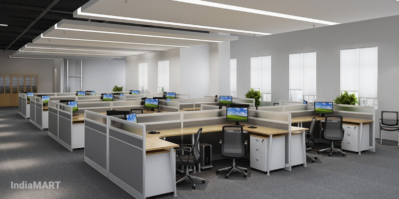
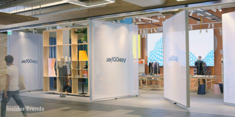
Since over 70% of Singaporean companies now support hybrid work — a shift reflected in data from the Ministry of Manpower — offices need to be more than just a place for desks. These evolving workspace needs reflect larger office renovation trends in Singapore that prioritize flexibility and employee well-being. They need to be flexible hubs for collaboration, focus, and well-being. Color is key to defining these zones.
To help your team concentrate, use colors that reduce distraction.
Where you want your team to brainstorm and connect, use color to spark energy and conversation.
Quiet rooms and breakout areas are essential for helping employees recharge.
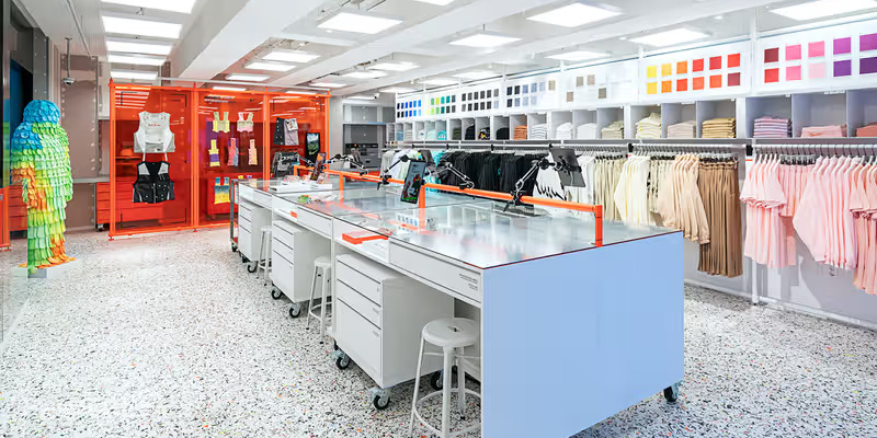
For retailers, the goal is to create an immersive environment that engages customers and encourages them to stay longer. Your color palette is central to this experience.
Your entrance needs to tell a story.
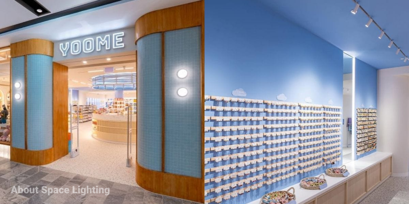
In many Singaporean retail units, space is a premium. Color can create an illusion of spaciousness.
Color can subtly direct where your customers look and go.
Color is one of the most effective and personal ways to define a space. By thoughtfully choosing a palette that supports your business goals and brand identity, you can create an office that inspires your team or a retail shop that captivates customers. It’s about creating an environment where people—and your business—can thrive.
Ready to transform your commercial space with the power of color? Let’s create an environment that is not just beautiful, but purposeful.
Connect with the Ad-Evo team to start your design journey. Let’s discuss your project. Get in touch with us here.
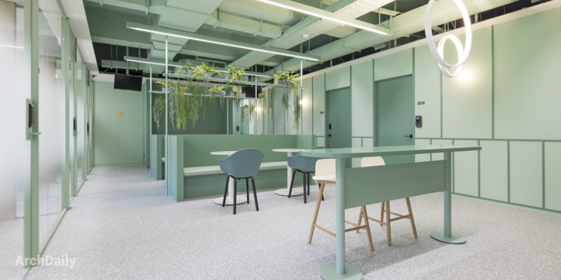
Cool tones like muted greens, pale blues, and soft greys are excellent for areas requiring focus, as they are calming and reduce distraction.
Use light and cool tones such as soft whites, pale blues, and light greys on the walls. These colors reflect light and create a sense of openness, making the space feel larger and more inviting.
It’s a simple guideline for creating a balanced color scheme: 60% of your space should be a dominant color (like walls), 30% a secondary color (furniture), and 10% an accent color (decor and accessories).
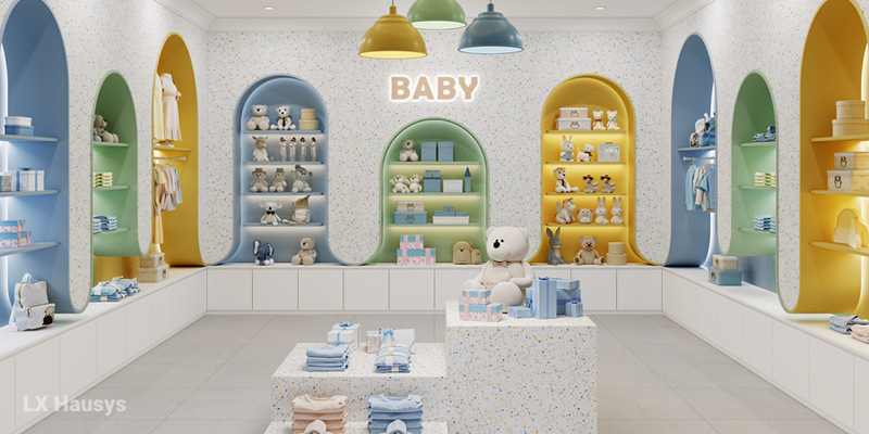
Warm colors like reds and oranges can create a sense of urgency and excitement, while cool colors like blues and greens promote calmness and trust, encouraging customers to browse longer.
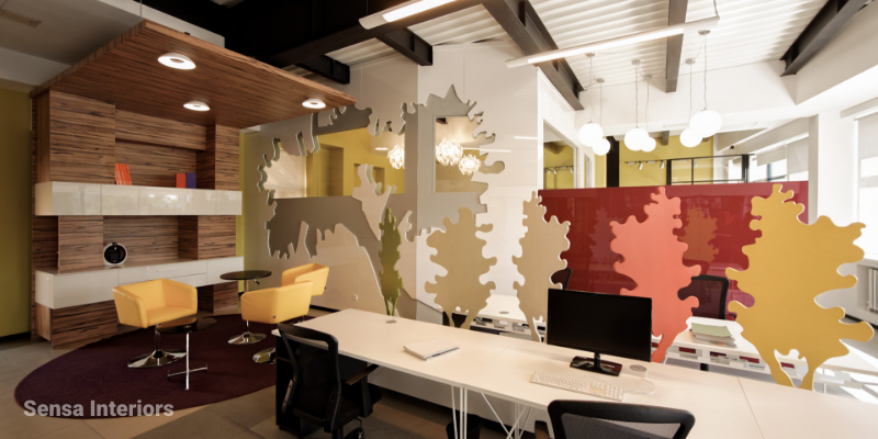
Yes, incorporating your brand colors through feature walls, furniture, or custom graphics helps reinforce company culture and strengthens brand identity for both employees and visiting clients.
Warm tones include reds, oranges, and yellows. They are great for creating a cozy, energetic, and welcoming atmosphere, making them ideal for collaborative office zones or retail entrances.
Cool tones include blues, greens, and lavenders. They feel calm, clean, and spacious, making them perfect for office focus areas, wellness rooms, or any space where you want to promote relaxation.
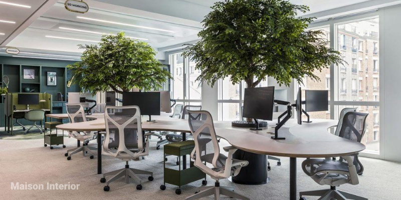
Biophilic design involves incorporating natural elements into a space. This includes using nature-inspired colors like greens and earthy tones, along with natural light and indoor plants, to lower stress and improve well-being.
Use different color palettes to visually separate areas. For example, a calm, neutral scheme for individual workstations and vibrant accent colors in a shared brainstorming area to define the space’s function.
The appearance of color can change dramatically depending on the lighting in a room, both natural and artificial. Testing samples on your walls helps you see how the color will truly look throughout the day.

